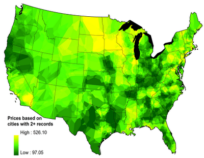
 The oddly named mapping website FloatingSheep.com has produced a map showing the differences in the retail price of cannabis in the United States, coast to coast. The map—apparently featured in the September issue of Wired magazine under the cheeky title "Infoporn: O Say, Can You THC?"—is based on information gleaned from consumer reports on the Price of Weed website.
The darker the shade of green, the lower the price. The dark areas ($300/ounce for the good stuff) are clustered around where it is grown—Northern California's Emerald Triangle is, of course, expected. Perhaps less so is the Ohio Valley, with Kentucky and western Tennessee especially dark-hued. The dark areas of Texas and Florida may be explained by proximity of the Mexican border and Gulf Coast entrepots. Languishing near the yellow end of the spectrum ($400 and up for the good stuff) are the Northeast (reflecting New England's short growing season) and the northern Great Plains (reflecting its sparse population and distance from production zones). An island of yellow in an otherwise green state is Southern California's Inland Empire, probably reflecting both its cultural conservatism and more aggressive policing.
FloatingSheep points out that the "crowd-sourced" data it has mapped—and produced a report on, "Data Shadows of an Underground Economy"—largely coincide with a recent study by the Justice Department's National Drug Intelligence Center, entitled "Domestic Cannabis Cultivation Assessment 2009" (PDF).
Map by FloatingSheep.com


Recent comments
1 week 3 days ago
2 weeks 4 days ago
3 weeks 2 days ago
8 weeks 4 days ago
15 weeks 11 hours ago
15 weeks 18 hours ago
18 weeks 1 day ago
19 weeks 18 hours ago
23 weeks 1 day ago
26 weeks 6 days ago